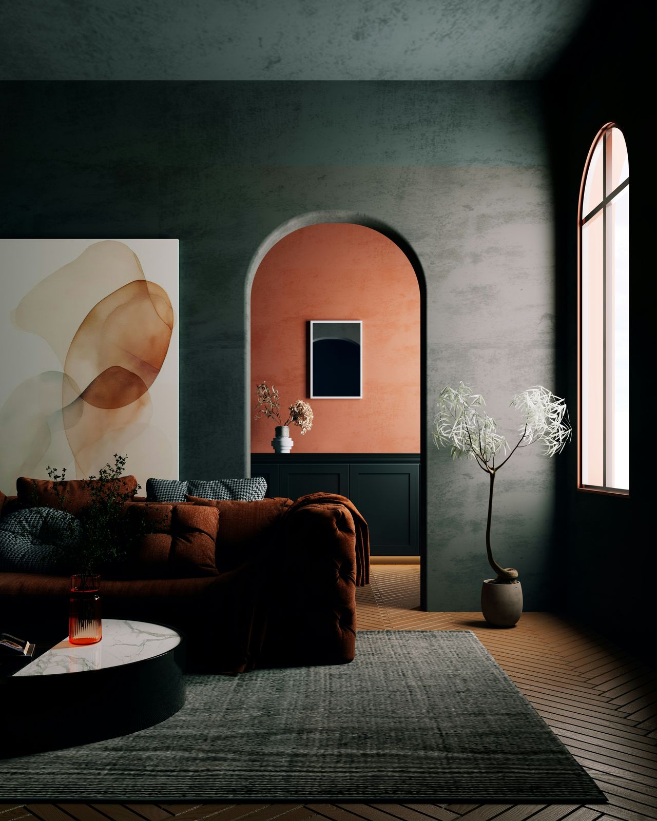
National paint brands entered 2026 with a clear message: the cool grays and stark whites that defined many homes over the past decade are giving way to colors with warmer undertones and more visible depth. That shift is now taking a more specific form, with Sherwin-Williams, Behr and Benjamin Moore all highlighting warmer neutrals, earthy greens and brown-based shades that add heat to a room without requiring homeowners to go fully beige or fully white.
Paint brands are defining the shift with specific 2026 colors and palettes

The paint industry’s 2026 forecast is not centered on one single color, but on a broader move toward warmth that is being documented by major brands in their official trend reports and product announcements. Sherwin-Williams named Universal Khaki SW 6150 its 2026 Color of the Year and described it as a warm, earthy tone that works with natural finishes, crisp whites and bolder accents, according to the company’s 2026 color launch. Benjamin Moore announced Silhouette AF-655 as its 2026 Color of the Year on October 16, 2025, describing it as a rich espresso brown with charcoal undertones in a press release from its Montvale, New Jersey, headquarters. Behr, in its own 2026 announcement, selected Hidden Gem, a smoky jade, and said the broader 2026 trends palette reflects a shift toward warmth, comfort and understated playfulness.
The numbers behind the trend matter because they show this is larger than a single marketing campaign. Rather than promoting one safe off-white, brands are releasing full annual palettes built around coordinated families of warmer hues. Behr’s 2026 trends materials present a multi-color palette designed to help homeowners build whole-house schemes with more personality, including shades such as Terracotta Urn and other earth-based tones. Sherwin-Williams’ 2026 Colormix Forecast also frames “foundational neutrals” as a wider range that extends beyond black and white into tans, taupes, saturated near-blacks and silvery grays.
Design media are tracking the same movement from the consumer side. House Beautiful reported in January 2026 that designers see soft brown, warm greens, muted terracottas and putty tones acting as the “new neutrals,” rather than traditional bright whites. Elle Decor, in its 2026 color trends coverage, likewise reported that neutrals are not disappearing but are becoming warmer and richer, with designers citing browns, rusts, greens and other earthy mid-tones. Taken together, the brand launches and designer commentary point to the same paint-color move: homeowners are still asking for versatility, but they increasingly want that flexibility to come with warmth and visible tone.
The change is showing up in everyday homes, not just designer showrooms

What is confirmed so far is that this color shift is being positioned for mainstream residential use, not only luxury design projects. Sherwin-Williams explicitly markets Universal Khaki as a color that can work across an entire home, pairing with wood finishes, white trim and stronger accents. Behr’s 2026 palette materials similarly focus on practical rooms, including living spaces, kitchens and home offices, and present warmer shades as part of accessible, coordinated interior schemes. That matters for homeowners because it suggests the trend is less about one dramatic statement wall and more about replacing cold-feeling defaults with colors that still function like neutrals.
The local impact is especially visible in U.S. housing stock built or renovated during the height of the gray-and-white cycle. Many apartments, suburban homes and resale properties still carry cool gray walls, bright white kitchens or flat greige common in the late 2010s and early 2020s. Designers interviewed by House Beautiful said the next step is not a full swing to heavily pigmented jewel boxes in every room, but a move to softer browns, putty shades, warm greens and clay-based colors that make interiors feel less sterile. Valspar’s color marketing team also signaled that direction in its 2026 Color of the Year release for Warm Eucalyptus, saying greens with warm undertones are increasingly serving as a new neutral.
What remains less clear is how quickly the shift will appear in large-scale rental turnovers, builder packages and lower-cost flips, where standard whites and contractor grays remain common because they are familiar and easy to specify. Paint companies have released broad consumer-facing forecasts, but they have not published a national count of homes, apartment units or remodels using these warmer palettes. There is also no single industry database showing how many U.S. households have already adopted these tones. Still, the consistency across brand forecasts, retailer-facing materials and designer reporting indicates that warmer undertones are moving into the mainstream market, especially for homeowners who want a room to feel more comfortable without committing to dark moody walls or a classic beige envelope.
The context is a reaction against cool minimalism and a search for livable warmth

The reason this is happening is rooted in a broader design correction now being acknowledged by both brands and working designers. House Beautiful’s 2026 neutral-trends report framed the change as a move away from sterile white walls and cool gray sameness toward colors that feel layered, grounded and more supportive of furniture, wood tones and texture. Designers cited in that report said soft brown adds warmth and depth while still functioning as a neutral, and warm undertones in greens and terracottas can make a room feel more welcoming without overwhelming it. Elle Decor reported a similar pattern, with designers saying clients are moving away from “millennial gray” and toward richer finishes and earthy mid-tones.
Brand messaging backs up that explanation. Sherwin-Williams described Universal Khaki as celebrating “the beauty of life’s bare essentials,” language that aligns with a less stark and less high-contrast version of modern interiors. Benjamin Moore said its 2026 color choice was influenced by renewed interest in classic silhouettes and the growing appeal of the brown color family, according to Andrea Magno, the company’s director of color marketing and design. Behr stated that its 2026 palette was built around personality, warmth and comfort, while its professional trends coverage noted that consumers and clients are increasingly looking for more depth and individuality in their spaces.
For residents, the practical meaning is straightforward. The current paint move does not require abandoning neutrals; it redefines them. In place of flat cool gray, designers and brands are recommending khaki, taupe, putty, clay, smoky green and brown-based shades that can still coordinate with wood floors, white trim, stone counters and existing furnishings. Based on the 2026 brand forecasts, homeowners and renters updating a room should expect to see more “warm neutral” language in paint decks, more brown-leaning and green-leaning options in whole-home palettes, and fewer default recommendations built around icy white and blue-gray. As of 2026, the industry trend is not a retreat from neutral paint altogether, but a recalibration toward color that keeps rooms versatile while making them feel noticeably warmer.